THE BUXTON MUNCH CO.
BRANDING | ART DIRECTION | EGD
OVERVIEW
Buxton Munch, a cherished mom-and-pop diner nestled on the scenic Hatteras Island, North Carolina, has been a true local favorite for 25 years, serving both locals and visitors since 1999. As a testament to their unwavering commitment to using fresh ingredients, Buxton Munch works closely with local fishermen to provide their customers with the very best, sourcing fish for their famous fish tacos right off the coast of the island.
I was initially drawn to Buxton Munch because of its stark lack of consistent branding, finding the unapologetic and mis-matched feel to be a testament to their primary mission of serving their community. After researching tourism in the area, I discovered that Buxton, North Carolina is home to just under 1,500 people and that a majority of local businesses, including Buxton Munch, rely heavily on tourism from the Outer Banks and surrounding coastal cities. They’ve always been a local best-kept-secret, but by giving them a fresh brand identity, they can attract more tourists and continue to sustain their community for years to come.
APPROACH
ACHIEVEMENTS
Silver Award, Graphis | 2024
Published in 60th GDUSA Annual Showcase | 2023
TRADEMARK | VISUAL IDENTITY | ICONOGRAPHY | PACKAGING | ADVERTISING | MENU SYSTEM | WAYFINDING & SIGNAGE | EGD | STATIONARY
DELIVERABLES

HOOKED ON LOCAL
Finding inspiration from their famous fish tacos, I set out to create a graphic icon that was inviting and and dynamic. Throughout my research of the existing brand, they continuously highlighted their famous fish tacos so it felt right to design their brand around that. Located less than a mile from the coast, I felt that fish iconography would go far in drawing in tourists to try the fresh-caught seafood from right off the coast. The elongated type treatment is pulled throughout the rest of the branding, as well as the fish imagery, creating a consistent and unique brand experience.
TRADEMARK
ALTERNATIVE MARK
Taking that same fish taco icon, I set it in a vertical space with the same warped and elongated type to create an icon that would work better as a fascia or storefront sign. Located off the highway in a shopping center, it’s important that Buxton Munch is easily accessible to their customers.
type & COLOR PALETTE
WAVE BREAK
R: 181 G: 222 B: 240
C: 27 M: 2 Y: 3 K: 0
RIPTIDE
R: 130 G: 191 B: 232
C: 46 M: 11 Y: 0 K: 0
DEEP SEA
R: 0 G: 23 B: 122
C: 100 M: 96 Y: 19 K: 16
BRAND VALUES
The fishing industry is vital to the area and Buxton Munch vows to support and protect it by buying from local businesses that fish with a conscience.
SUSTAINABILITY
FRESH INGREDIENTS
Only the very best fresh-caught seafood and local produce makes it on the plate.
At the end of the day, we’re all little fish in a big sea but Buxton Munch looks out for their own by supporting local fishermen and other small businesses in the area.
COMMUNITY
LOCATION & BRAND POSITIONING
Strategically situated on the main part of Hatteras Island, Buxton Munch is the ideal destination for delicious takeaway, catering to visitors exploring the historic Cape Hatteras Lighthouse, scenic beaches, and engaging in watersports. Positioned as the premier choice for a beach picnic, the restaurant is conveniently located near the ABC Liquor store, offering patrons the opportunity to pair their renowned fish tacos with a refreshing beverage for an enhanced picnic experience.
DELIVERABLEs
ICONOGRAPHY
A system of animal iconography based on menu items. Created around the different types of tacos available, the main use of these icons is in sticker form to differentiate tacos for the customer.
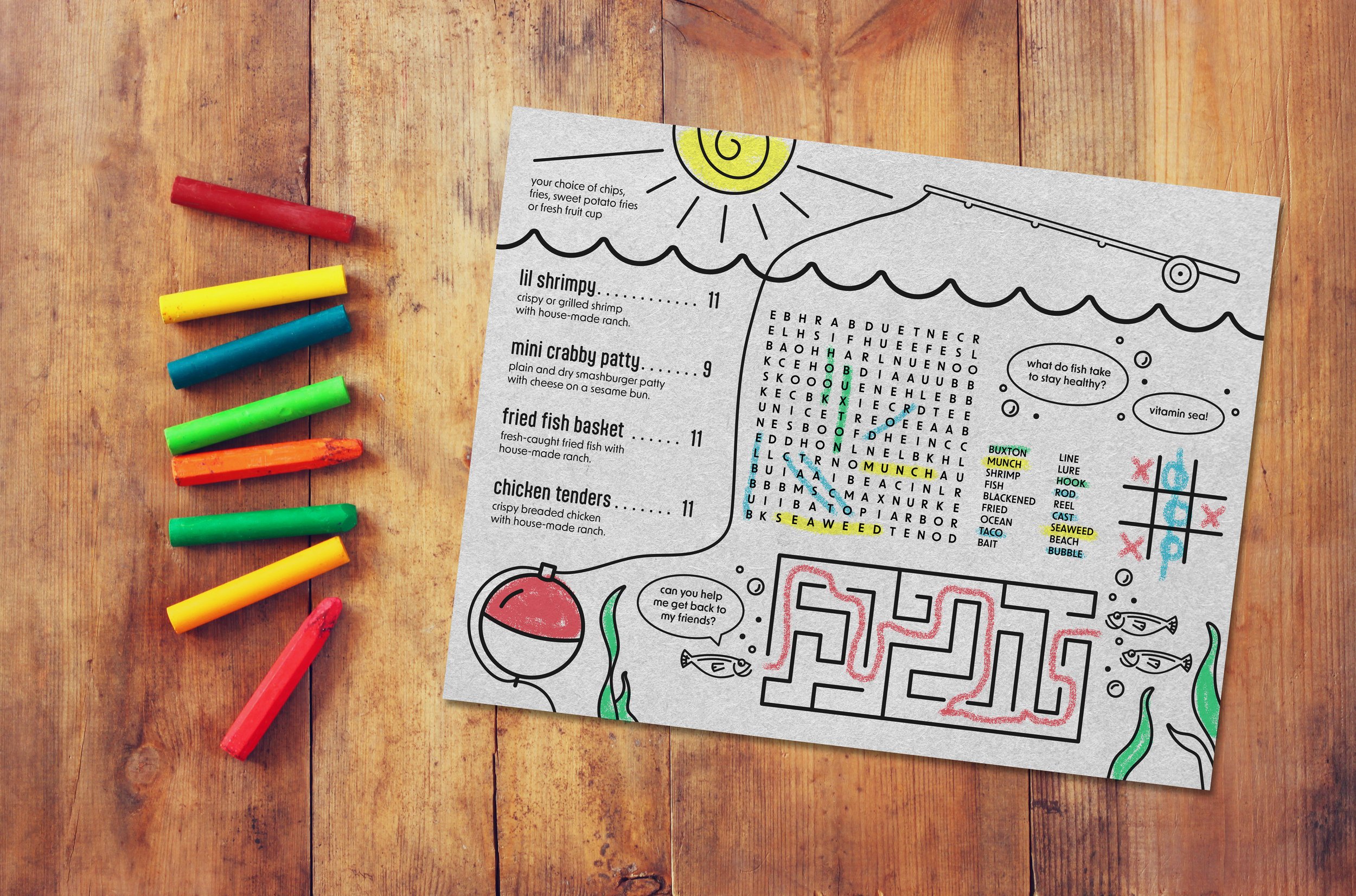
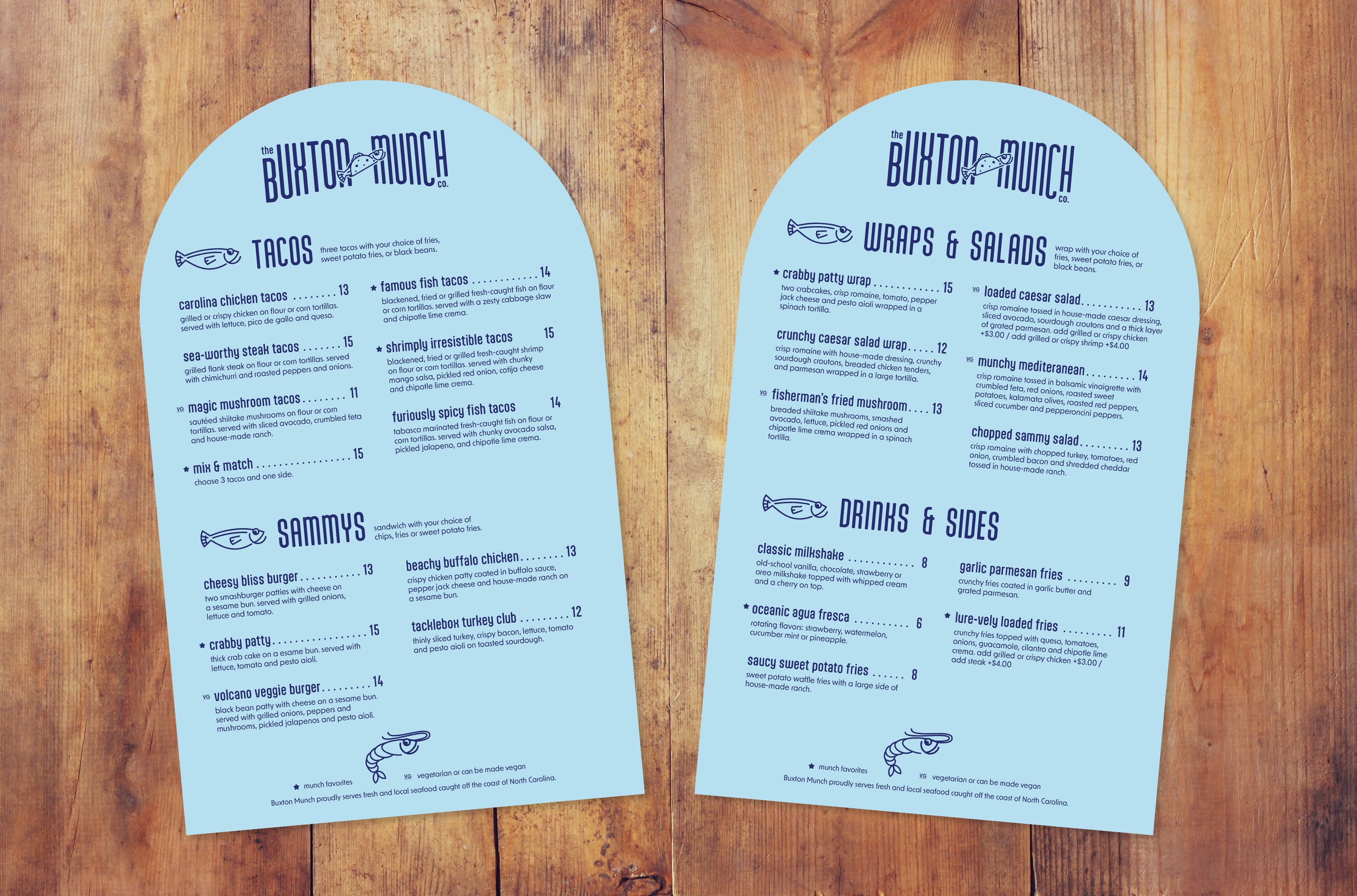
Menu updates were prioritized by redesigning the original crowded, handwritten version. The main menus now feature a rounded top, ensuring consistency with other design elements such as signage and the building exterior, resulting in a cohesive look. To enhance the kid-friendly aspect, a menu with interactive games and coloring on newsprint was crafted, subtly referencing the traditional practice of wrapping fresh fish in newspaper.
MENU SYSTEM
SIGNAGE
Since Buxton Munch doesn’t have a takeaway window accessible to the outside and they rely heavily on those orders, I wanted to create direct signage that points people in the right direction of the to-go counter, keeping the flow of takeout orders away from the dine-in experience.
TO-GO
SEATING
As a former host, I realize the importance of a double sided sign for when a host is and isn’t present to seat guests.
MENU BOARD
Following the same shape, this menu board can be placed outside so tourists can easily see what Buxton Munch has to offer, as well as inside at the order counter.
EGD EXTERIOR
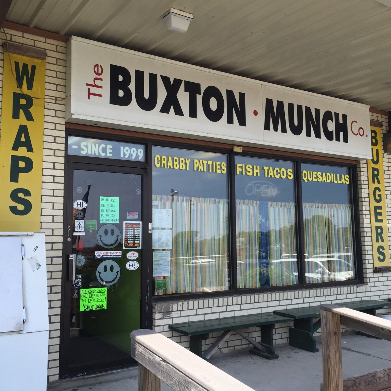
The current exterior of the building lacks appeal from a distance and blends into the surrounding shopping center. Its lackluster appearance fails to attract tourists and doesn't align with the coastal ambiance of the area.
BEFORE
Painting the brick and trim brightens the exterior, drawing attention to the business in the shopping center. White vinyl cutouts create the illusion of rounded windows without replacement. A new awning with a sign above provides shade without obscuring the signage. An outdoor menu board enhances traffic flow and informs tourists about Buxton Munch's offerings. The new design projects a clean coastal restaurant, appealing to tourists.


